week 4: lively colour
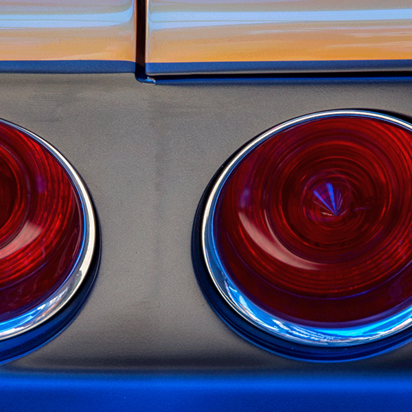
Hue and saturation can have an impact on the mood of a photograph, but so can the proportions of how these are used in the picture space. I placed this image into the "lively colour" theme rather than "bright/Bold colour" despite the fact that the red, blue and orange are vivid. Slightly more than half of the image space is grey, and this relatively large area helps to modify the overall impression of the photograph, calming it a bit, while allowing it to maintain a lively, upbeat mood.
Please click here to see Larry's image.
Please click here to see Larry's image.
|
Also in: 52 week project: Colour
 |  |  |  |  |
 |  |  |  |  |
 |  |  |  |  |