week 50: mostly one colour
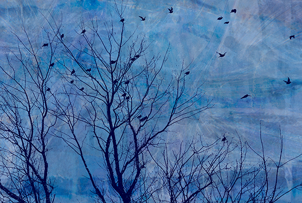
The only colour in this image, a digital composite of about fifteen photographs, is blue. There is great variation in tone, and the hues range from navy to aqua and everything in between. The original photograph exhibited a fairly serene mood despite the motion of the birds, but the bland grey overcast sky background was dismal. In choosing an overall colour scheme for the composite, I decided on blue, which suggests water and sky and often represents peacefulness and calm. That would reinforce the serenity of mood, but I deiberately selected blues that were lively to support the sense of energy from the birds.
Please click here to see Larry's image.
Please click here to see Larry's image.
|
Also in: 52 week project: Colour
 |  |  |  |  |
 |  |  |  |  |
 |  |  |  |  |