week 9: mostly one colour
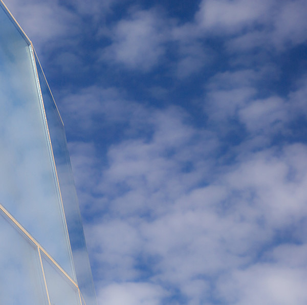
Although there is a substantial amount of white in this photograph (white being a non-colour in this case), the overall impression of this photograph is a feeling of "blueness". There is a gradation in the tones of the blue in the sky, and the reflection in the glass building is a slightly warmer turquoise blue. As the most universally well liked colour, blue often represents calmness and tranquility. The simple composition of this image, the soft, mottled shapes of the clouds and the gentle blue colour all help to create a feeling of serenity and peacefulness.
Please click here To see Larry's image.
Please click here To see Larry's image.
|
Also in: 52 week project: Colour
 |  |  |  |  |
 |  |  |  |  |
 |  |  |  |  |